Back to the Future
- Hayley Roberts
- Oct 26, 2015
- 4 min read
Updated: Nov 19, 2023
Seeing as Back to the Future day is now in our past and even I, a committed fan, am quite done hearing about it for the time being, I no longer want to dwell on why I made this tribute image. But I do want to talk about how I made it and what I learnt in the process.
The easy solution would have been to Photoshop Michael J Fox out of the original image and replace him with myself but that’d be cheating! Instead I wanted to photograph myself and my Lego DeLorean and then recreate the scene using stock, which ended up being a fantastic exercise because I had to analyse every little piece of the image, figure out what stock I could use to replicate it and then draw on various Photoshop techniques for the effects. I wouldn’t normally recommend copying someone else’s image and releasing it to the world but this is an exercise I firmly believe every budding Photoshop artist should try to really hone those skillz.

I first had to figure out what I could wear to look like Marty. This ended up being a pair of my jeans, one of my dad’s shirts, a red tunic with the sleeves and buttons removed in Photoshop (I had nothing else resembling a puffy red vest), a pair of 12 year old white sneakers that were literally crumbling whenever I walked, a denim jacket, a black Fitbit and my every day sunglasses (I didn’t have mirrored ones). I used a stepladder to rest my foot on and I had a Speedlite set to full power facing up from about waist height to mimic the bright light from the car. I shot the image back to front and flipped it because I don’t like the left side of my face. I also learnt that underlighting turns me into Seinfeld’s girlfriend from ‘The Strike’ (the one who looked okay in certain light and bloody terrible in others) and all of these images will soon get deleted so I never have to see them again. To get the pose and camera angle right I had to keep running between the garage where I shot it and the living room where my computer was to reference the original image and it was hot in all those clothes and uncomfortable in those flaky shoes. Why I didn’t just print out the image is a mystery for the ages. I shot the pose both with and without the tunic so I could easily remove the sleeves in Photoshop and still see the jacket below.

In Photoshop I smoothed the line of the jeans, replaced my watch hand (because I was holding the remote in it), replaced the shoe that got cut off, fixed the tunic and my messy hair, retouched my face and changed my eyes because they weren’t open enough which explains why I look like I’ve had a botched facelift in the final image.

I photographed the Lego DeLorean on my kitchen bench, trying to keep it in as much focus as possible, particularly in the area where I knew I would be standing. I had to shoot it down low to get the angle right and my mum shone a torch on the inside of the car where the bright light would be coming from. I then liquified the front of the car in Photoshop to make it look like its melting.

To create the scene I bought an image of a road from Adobe Stock because none of my pictures of roads had the right angle. Despite actually buying the image (I promise!) I somehow ended up with the low res preview version in the final image – oops!

I used my own photo of dark blue clouds for the sky and then overlaid a bunch of other cloud photos to get the billowing smoke effect. The pink and orange sky came from a sunrise photo I took in Edinburgh.
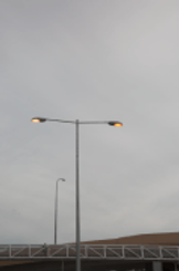
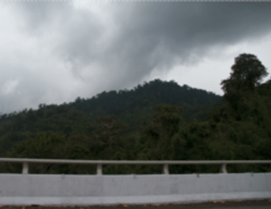
The light rays came from a band photo I took of the Presets, which was duplicated over and over and moved to match the ray positions. I used this image of a streetlight for the lights and a Graphic Stock image of a flare for the light itself which was added with the ‘Lighten’ blend mode. The mountain was shot out of a car window in Malaysia which I then blurred heaps so the trees weren’t so detailed.
The fire is made up of about 6 different stock images purchased from Graphic Stock and Adobe Stock that I also blurred a bunch. I added a noise layer over the background and the car to get the really grainy look of the original. Finally I added a yellow outer glow around my body, drew in the shadows and bright light, and then toned the colour and lighting using about 50 different adjustment layers.

The funny thing is there’s a lot wrong with the original image – why the weird blue spot over the car on the left? why is there a bright white square on the road bottom right? why is Marty brightest on his right side when the light is coming from the rays on the left and the fire below? why are the shadows on his face and arms really red? why did they make the DeLorean look like it was melting? why are the fire tracks a weird angle and shape? Anyway! It was not up to me to wonder why, but how. And hopefully my image is more of an ‘homage’ than an insult to the world’s greatest film franchise. 🙂


